Sounds like an oxymoron, I know. But ever since grad school, a lifetime ago, when I read a book called “How to Lie With Statistics,” I’ve seen some fun in it. I recently read Thomas J. Stanley’s blog where he posted an article titled Average Rich or Median Poor? In it, he discusses that median (the middle number of all observed) household wealth is but a fraction of average household wealth, about 1/5 or so. This goes to illustrate the concentration of wealth in this country.
On a different note, today I wanted to talk about median home prices.
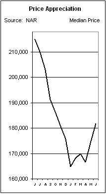
Let’s look at this chart, the 12 months ending June 2009. On the news they’ll tell you home prices are down 15% from a year ago. But does that really mean anything? Think about this. Does the drop you see from June until January even mean anything? Not much to me, anyway. The number graphed here is the median sale price for home sales in the given month. In an economic crisis, the kind we are in the midst of, it would stand to reason that higher end homes would not be enjoying the turnover the lower priced ones would see. See where I’m going with this? The numbers charted do not discuss same home value, only the value of observed transactions. Say there’s a town of mostly $500K homes, with little turnover, everyone there is pretty happy and the houses are not for sale. A builder comes in and with everyone’s approval builds nice homes, a bit smaller, and they sell for $400K each. Even though the $500K houses lose no value, and may very well start to sell for $550 or more, the transactions at $400K are the ones that hit the data and the median sale is that $400K. This is just one way the numbers get distorted and the facts presented by the media, while true, still don’t tell the whole story.
Joe

