I’ve always been intrigued by data, statistics, and how the numbers are interpreted.
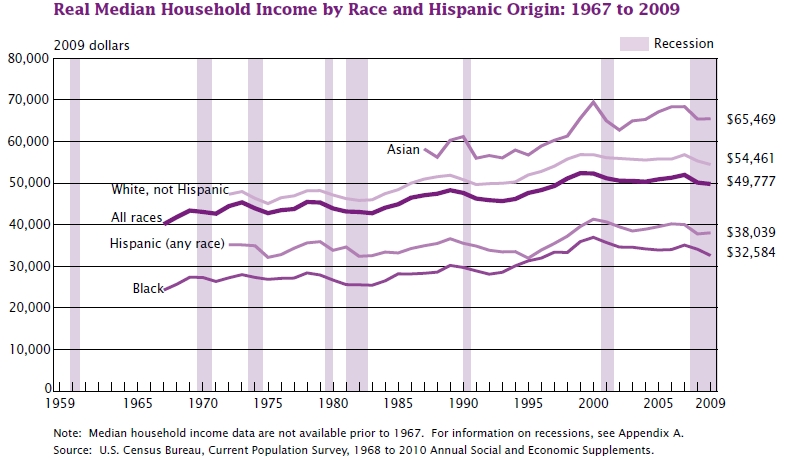
I look at this chart of inflation-adjusted median income and it seems we have stagnated the last dozen years or so. Over the 42 years represented in this chart, real income has increased by less than 25%, or about 1/2%/yr compounded over that period. I don’t know which aspect of this chart I find more disturbing, the racial disparity that seems to go along with no solution, or the lack of a major rise sourced from the productivity gains we were supposed to see as we became more reliant on robots and electronics. This productivity should have spilled into all our paychecks. Want to look at this chart’s source? See Income, Poverty, and Health Insurance Coverage in the United States: 2009


I find it even more disturbing that, considering that a minority of households had two incomes in the 60’s, it took most households to become two-income ones to just barely keep up.
I missed that observation, you are right. This chart is not individual, but family income, and the number of earners per family has crept up over this period.