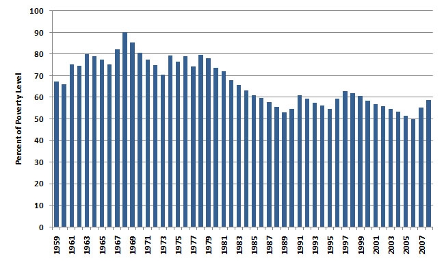
President Obama recently called for an increase in the minimum wage, from the current $7.25 to $9.00 per hour. I found two charts to be of interest in furthering this discussion. First, the minimum wage as a percent of poverty level income.
This graph helps illustrate how those earning only minimum wage have failed to keep up with inflation and from a high of 90% of poverty level income are now closer to 60%. I’m not suggesting the minimum wage should be a particular fraction of poverty level income, just observing this graph goes in the wrong direction.
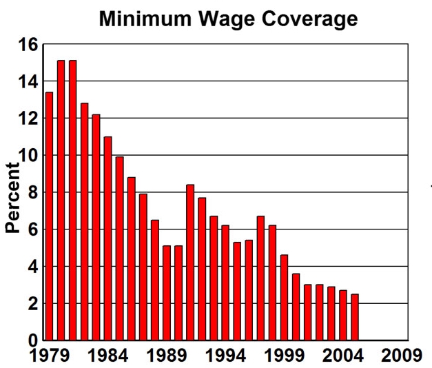
I know that there’s a strong case to be made for higher minimum wages resulting in the loss of jobs, although the data supporting this is a bit sketchy. I’d like to offer one more graph to show why I feel this way.
We are talking about just 2% of workers. Had the minimum wage tracked inflation, adjusted annually, businesses would have planned for it and dealt with the cost each year the same as they deal with rising fuel bills or any other component of their costs. With half of these workers being under 24, and not necessarily family breadwinners, we shouldn’t forget the half who are.
I remember a $3.10 minimum wage. It was enough to have pocket money as a teen. And it was awkward working side by side with those who were lifers, people who did this not for beer money, but to pay their bills. Keep in mind, if you look at $3.10 in 1980, it inflation-adjusts to $8.50 in 2012.


When I started working as a teen, it was $6.50 an hour. It more has to do with how the person is with their finances, because then the minimum wage won’t rise.
$7.25 as a minimum wage is ridiculous. If you have to work an hour just to buy a bigmac meal something is wrong.